
As fans saw in Monday night’s game, there is great potential in Nike City Connect jerseys. Though not everyone universally adores Houston’s dark blue Space City set, the reviews I saw on Twitter were generally positive and at least into the idea, if not the full execution.
The Cleveland Guardians do not have a City Connect jersey and will not have one this season, unfortunately. The series, which was created to “celebrate the bond between each Club and its city” through visual representation of “the personality, values, and customs that make each community and their residents unique,” has been rolled out for 14 MLB clubs so far. However, all 30 teams will have their own jersey within the next couple of seasons.
With no plans announced for Cleveland, I figured we should do some market research to let Nike know how to make a truly great uniform for the Guardians. And a truly great design begins with a great overall concept.
Like Kansas City’s fountains and Houston’s connections to the aerospace industry, Cleveland’s jerseys need to highlight something unique about the city. Though the team went with transportation for the name change, that’s not really unique enough to Cleveland to make a good City Connect theme. For better or worse, Cleveland is well-known for rock ‘n’ roll and a river catching on fire. Cleveland is also known by many nicknames, including the Forest City, the Sixth City, and, simply, The Land — each of which could make for an interesting theme.
Since we’ve seen enough guitar-inspired design lately and only one groan-inducing theme needs to be included, we can limit ourselves here to four ideas: burning river, Forest City, Sixth City, and The Land.
Poll
What theme do you like best?
-
26%
Burning river
(70 votes) -
19%
Forest City
(53 votes) -
1%
Sixth City
(5 votes) -
51%
The Land
(138 votes)
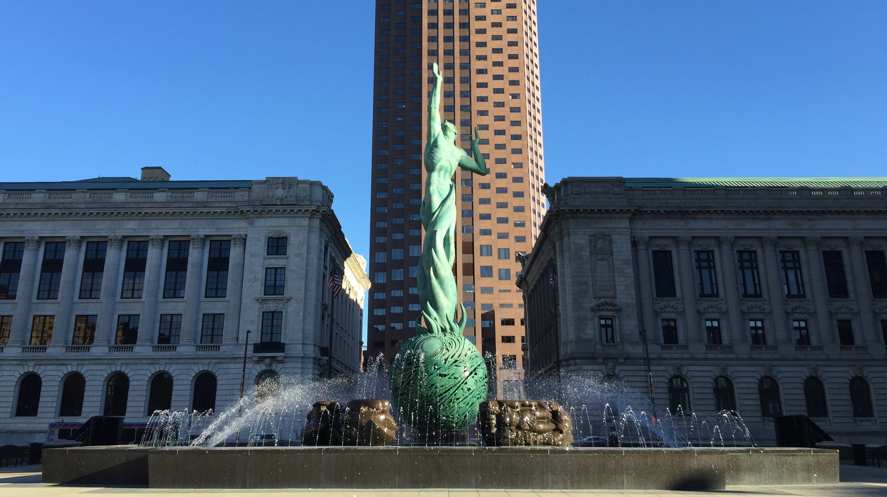
Each theme will go a long way in determining the color scheme, but there is a lot of overlap to be had between the themes above. For instance, a red-heavy palette with other chthonic hues would obviously work well for the burning river theme, but tying into other local franchises (e.g., the Cavs) for The Land theme would also rely heavily upon red. Green is an obvious choice for the Forest City theme, but could also work with the Sixth City theme, which is based on the city’s prominence in the early 1900s when buildings like the West Side Market (which have prominent green elements in their facade), the Fountain of Eternal Life, and Library (which has a beautiful green ceiling) were built.
Of course, not every City Connect jersey departs from the club’s usual colors. The Dodgers, for instance, have a jersey that uses the same colors but more heavily features blue; ditto the White Sox, emphasizing black. Nike could choose to do something similar for the Guardians or tweak the existing color set into brighter colors like they did with the Giants.
Poll
What color scheme do you like best?
-
33%
Red-heavy
(74 votes) -
23%
Green as primary
(52 votes) -
5%
Current colors
(13 votes) -
37%
Current colors (remix)
(85 votes)
Finally, the iconography matters on both the hat and the jersey. Some teams have unique logos for each (Astros, White Sox), some have a new element on the jerseys but no the hats (Giants, Red Sox), and some have unique hats with familiar jersey elements (Marlins).
For Cleveland, let’s start with the hat. One option, of course, is to keep the new “diamond” C logo, which is really a nice design (not to mention a huge upgrade on the block C). Adopting a historical logo, like the Marlins’ cap does, is also an option, and my personal favorite would be to use the logo of the Cleveland Forest Citys from the National Association. Similar to the White Sox, something with “CLE” would also be nice and could tie into any design. Alternately, stylizing letters into something resembling a local landmark (like Kansas City’s hat) has great potential; I think something like a C made to look like the Terminal Tower would be particularly striking.
Poll
What should the hats have on them?
-
8%
Diamond C
(18 votes) -
30%
Historical logo
(64 votes) -
19%
CLE
(40 votes) -
41%
Local landmark
(88 votes)
With the exception of the Dodgers and Royals (whose hat and jersey have the same graphics), each jersey contains its own design elements. For Cleveland, this could include pinstripes (like the team has worn variously in the 1910s, ‘20s, 30s, 50s, 60s, and 70s); architectural-inspired patterns (for example, mimicking the ceiling of the library, the windows on the West Side Market, the glass front of the Rock Hall); the caveman font; or a script (similar to recently retired uniforms debuted in 1994).
What the shirts say and how they are designed likely depend a lot on the theme, but it’s easy to imagine “The Land” written with any of the elements listed in the previous paragraph incorporated.
Poll
What should the shirts have on them?
-
10%
Pinstripes
(22 votes) -
62%
Architecture-inspired patterns
(132 votes) -
10%
Caveman font
(21 votes) -
16%
Script
(35 votes)
My ideas are far from exhaustive, and you may be ideas that I did not think of that are even better. Vote in the polls above and share your opinion on my ideas, and leave your own ideas (or recommend others!) in the comments below. Let’s tell Nike exactly what we want to see whenever they’re ready to care about Cleveland again.
"crowd" - Google News
May 25, 2022 at 11:00PM
https://ift.tt/AUyPZgF
Crowd-sourcing the Guardians’ City Connect design - Covering the Corner
"crowd" - Google News
https://ift.tt/kvN3Kbj
https://ift.tt/qZrkujQ
Bagikan Berita Ini


0 Response to "Crowd-sourcing the Guardians’ City Connect design - Covering the Corner"
Post a Comment